Covid-19 is finally in retreat in many regions of the world. As a result, governments are starting to lift travel restrictions.
Airlines across the globe are now wondering: How can we safely restart an essentially grounded industry? We need a dynamic, data-driven strategy to identify the safest and most in-demand travel destinations. Haphazard guesswork about which geographical locations to prioritize could not only result in empty cabins, but also in further contagious spread — which could exacerbate the severity of the pandemic and prolong the damaging effects of Covid-19 on the aviation industry.
To help carriers navigate through this uncertainty, we developed the Market Recovery Map (MRM). The MRM provides airlines with a simple, yet accurate and dynamic tool to identify the most promising countries early on, thereby allowing a real-time response to travel trends and pandemic developments. The overall objective of the MRM is to aid airlines in achieving a smoother, faster reopening over the next weeks and months.
A strategic framework for a smart return to the skies
The airline industry is under considerable financial pressure to pursue a rapid revamp program given the fact that core markets in the US, Europe, and Asia have experienced a drop in travel volume of up to 90% in recent months (see our Flight Demand Tracker).
Realistically, however, airlines must begin by servicing a limited, targeted, and strategic selection of destinations. The industry faces a two-pronged task: scheduling flights that match customer demand, and selecting destinations that won’t inadvertently contribute to a new spread of the coronavirus. This requires carriers to keep one eye on travel demand, and the other on the latest public health stats. Combining these two perspectives into one holistic strategy poses a significant challenge.
To address this difficulty, our strategic MRM integrates current Covid-19 statistics with real-time data on air travel capacity into one visual framework. Our tool allows for a simple interpretation of the best and worst travel destinations from an airline perspective.
The MRM enables airlines to:
- Identify the most promising markets that are recovering the fastest from Covid-19. This helps airlines to shift focus quickly and allocate resources effectively.
- Assess the relevance of markets where Covid-19 rates are surging or receding. Airlines can thus focus and prioritize specific regions.
- Fine-tune long-term strategy. The MRM helps to follow and visualize market conditions over time, allowing airlines to develop a long-term plan.
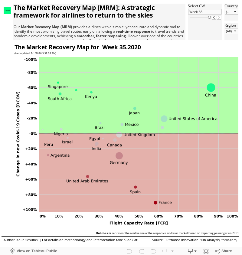
Below is the MRM as of June 15th with an interactive, always up-to-date Tableau version further below for even more details:
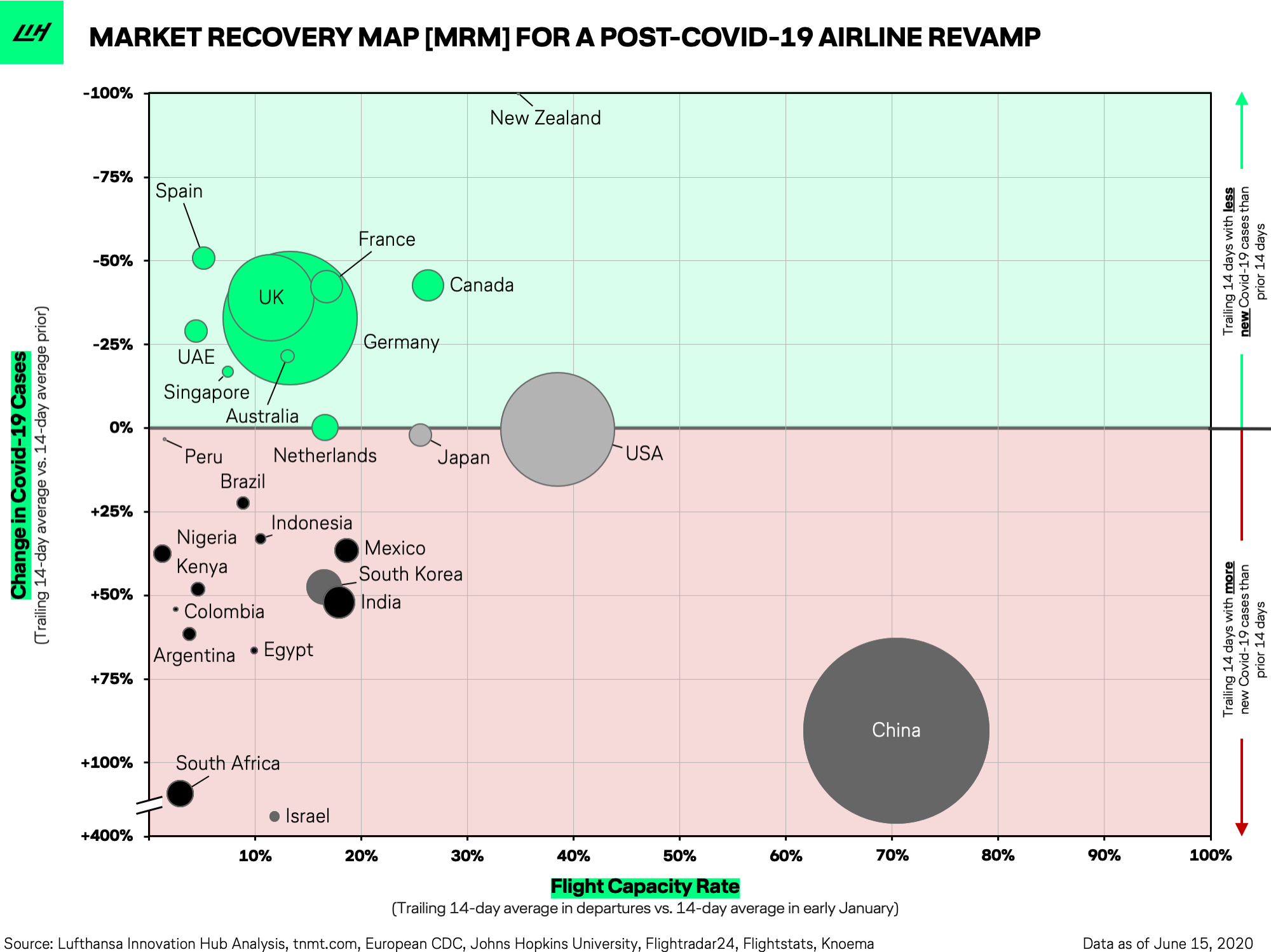
As the chart illustrates, the MRM integrates three important dimensions:
- Flight Capacity Rate (X-axis) shows the share (in %) of current flights compared to “pre-Covid” flight capacity. This rate is calculated using the trailing 14-day average of daily departures as a share of the number of daily departures to that same destination in early January 2020. For example, for the two-week period ending on June 14, the U.S. had a flight capacity rate of around 38% compared to early January.
- Change in Covid-19 Cases (Y-axis) shows the change in confirmed new coronavirus cases per country. This rate is calculated as the number of new cases in the trailing 14-day period, expressed as a share of the number of new active cases in the 14-day period before that. This change rate provides an indication of whether the coronavirus is on an uptick or downtick in the respective country. For example, for the two-week period ending on June 14, Canada experienced a -40% change in new Covid-19 cases, meaning that the total number of new cases was 40% lower during the last two weeks than the two weeks prior.
- The bubble size of each country represents the importance of the respective market, based on international outbound departures in 2019. A person who makes several international trips is counted each time as a “new departure”. For example, China is the biggest country by the number of outbound international departures in the world with about 149 million, accounting for close to 13% of the world’s total outbound departures.
How should airlines read the MRM?
The MRM is divided into two main areas: an upper green and a lower red territory. Countries in the green area are experiencing falling rates of Covid-19 infections, while the red area is experiencing increasing rates. This is an important distinction to make as they clearly define the direction of the Covid-curve in each country.
Let’s take a closer look at both of those areas.
Green light countries
The MRM immediately reveals which markets are most promising, thanks to declining rates of Covid-19 infections. Based on recent data (calculated June 15, 2020), most major European and North American countries, as well as several Asian countries, are experiencing positive developments in “flattening the curve” (falling Covid numbers).
These countries represent destinations where travelers will likely feel comfortable traveling to in the upcoming weeks. Airlines should prioritize these markets in the weeks to come.
Germany, the U.K., France, Spain, and Canada seem to have turned a corner and may represent favorable destinations. These countries appear to have the pandemic under control. However, limited flight capacity suggests that governments in these countries are acting rather cautiously, allowing airlines to only operate a limited number of flights so far. Since most European countries lifted travel restrictions as of June 15, 2020, we expect domestic travel within the European Union to accelerate in the coming months.
Red light countries
Countries that fall into the red half of the MRM — especially those within the bottom left quadrant — are currently struggling to get the coronavirus under control. Many of the countries in this space are developing markets with arguably less developed healthcare systems. Strict travel restrictions, containment measures, and border closings remain in place for the most part. Given these facts, a re-opening of domestic and international travel in these regions seem far-fetched for the moment.
Within the red area, it is important to differentiate between distinct groups:
Firstly, countries positioned on the right-hand side of the red light area as they show higher flight capacity rates despite growth in Covid cases. In other words, these markets have revamped their flight volume despite a fragile virus containment. The US is currently at the edge of falling into this area. We recommend a closer analysis of individual regions and destinations for these arguably “overconfident” countries.
Secondly, countries that only recently fell into the red area due to a sudden resurgence of new Covid-19 cases after much success in their initial attempts to reign in the virus. South Korea tends to be such an example. In fact, Korea had reported a steady decline in new cases throughout early May – leading to a quick increase in flight capacity – before it was hit by a significant second wave that led to partial lockdowns in selected cities. Israel is currently experiencing a similar situation with a second wave hitting the country severely. Also, China experienced a new outbreak in Beijing in mid-June that led to a surge in new Covid-19 infections, moving China towards the bottom of the red area after many weeks in the upper green half. Our recommendation for countries in this group is to monitor them diligently as we expect them to enter the green zone again soon. However, flight expansion into these markets should proceed with a lot of caution. A “wait and see” approach may be most appropriate.
And last but not least, countries in the left third of the red zone as they are characterized by upward-trending Covid-19 figures with very limited flight capacity (as of today), indicating heavy travel restrictions. Flights to these destinations are not advisable at this time. We find many of the developing countries in this area. However, since many of these countries are considered rather niche markets for most international carriers, their impact on overall flight capacity should be manageable.
For a more dynamic and detailed view, check out our our dynamic version of the MRM in Tableau, which we will update on a weekly basis:
What’s next for airlines?
The Covid-19 pandemic is far from over. And yet, the aviation industry can’t remain motionless forever. Airlines need to move forward with a strategic and incremental reopening of routes to selected destinations. At the same time, carriers can’t afford to lose sight of the latest developments. In the coming months, maybe even years, flexibility and agility of airline operations will be key. Airlines must be in a position to react quickly to flares of infections. And to do so, they will need to rely on real-time tools and data models that can integrate air travel data with public health statistics to spit out clear recommendations about where to add or reduce capacity at a moment’s notice.
Our MRM is a first step in this direction and something airlines may be able to build on. Airline experts could use the initial results and follow up with a closer examination of local conditions, current travel restrictions, government projections, and other relevant sources of information.
More on the data sources used for the MRM:
Flight capacity data is collected from Flightradar24 and Flightstats, both online platforms publishing real-time commercial aircraft flight tracking information as well as historical flight data by airports. The providers aggregate the data from multiple data sources — outside of the U.S., the data comes mostly from crowdsourced information gathering by volunteers with ADS-B receivers and satellite-based ADS-B receivers.
Change in Covid-19 case data is collected from the European Centre for Disease Prevention and Control (ECDC), an independent agency of the EU, similar to the CDC in the U.S. The data is cross-checked with data from Johns Hopkins University (JHU).