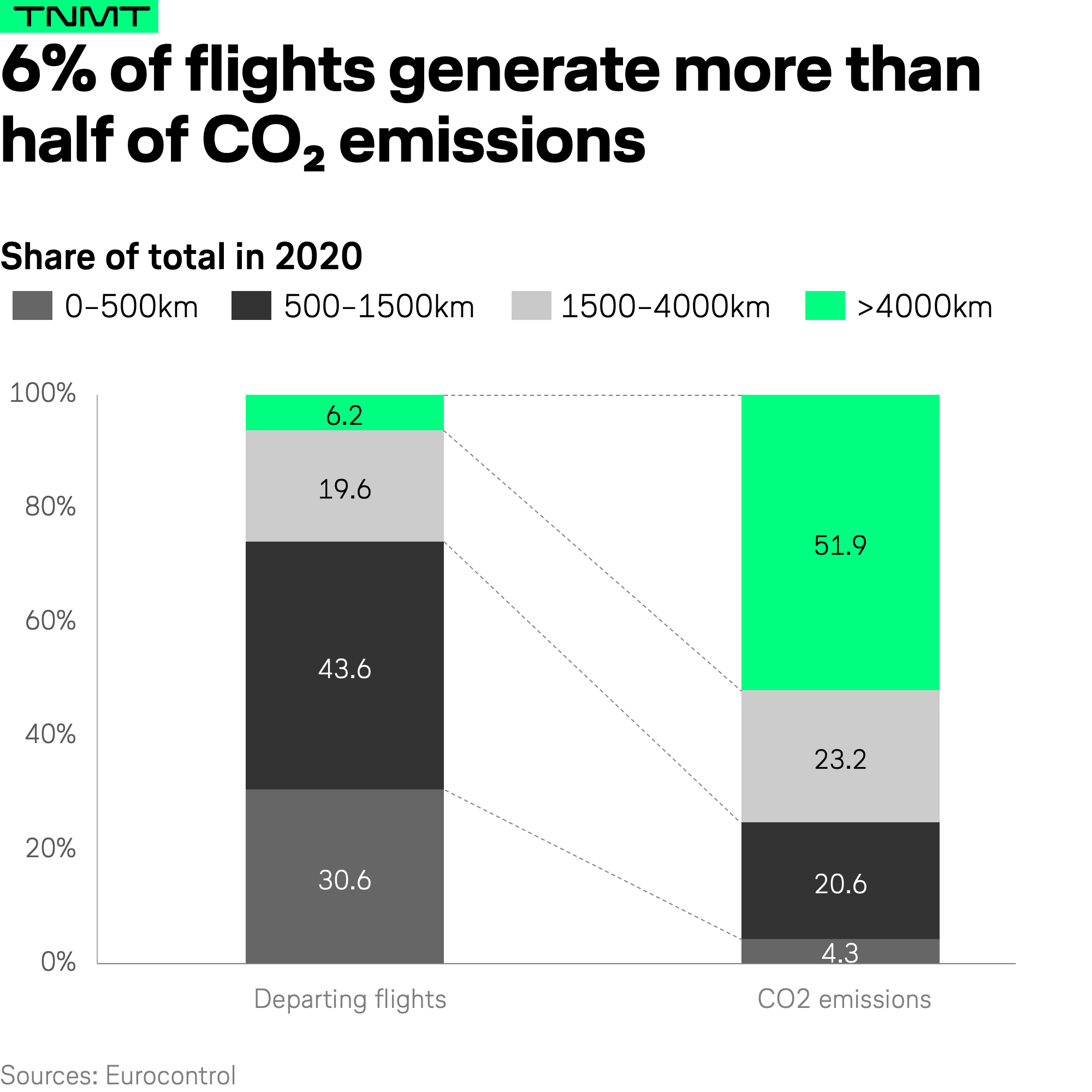
The data chart of the week comes from Eurocontrol.
They calculated that half of CO2 emissions in 2020 came from just 6% of flights: the long-haul ones.
How come? Longer distances naturally mean longer duration flights, and mostly by larger aircraft.

What the chart also shows is that flights shorter than 500km (30.6% of all departures in 2020) only generated 4.3% of emissions last year.
An interesting data point, keeping in mind that domestic flights are usually considered as the scapegoats for the climate crisis.
So long-haul flights are bad and short-haul flights are not?
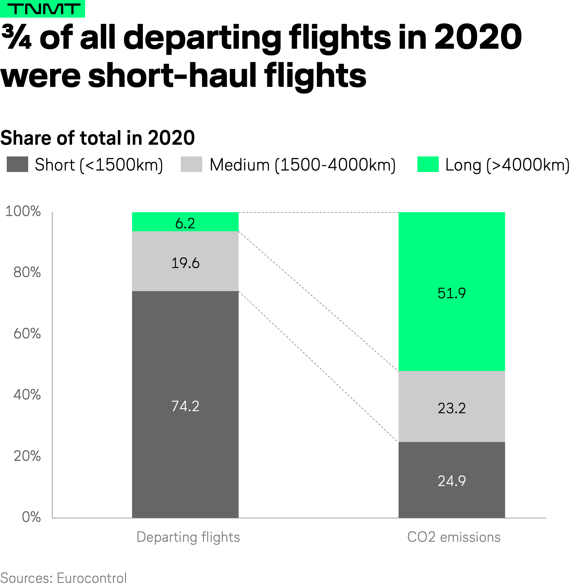
Well, the Eurocontrol chart is slightly misleading because the standard definition of short vs. medium vs. long-haul flights is different than the chart suggests.
Short-haul flights are usually defined as flights up to 1500km. Applying this logic to the chart and the numbers look different.

As you can see, short-haul flights now make up a quarter of total emissions, not 4%.
And even with this modification, we can’t really treat short and long-haul flights the same.
- For most long-haul flights, there is little to no alternative for passengers and urgent cargo while many short-haul flights could be avoided by using the train.
- Furthermore, for a cleaner apple-to-apple comparison, we should consider CO2 emissions per capita and kilometer. In this case, the impact of short-haul flights would become a lot worse.
Speaking of a more comparable benchmarking approach, we are currently putting a big research piece together.
Think of it as an extension of our 2019 infographic where my colleague Kolin compared the carbon emission output per kilometer for all major transport modes.
Stay tuned.


